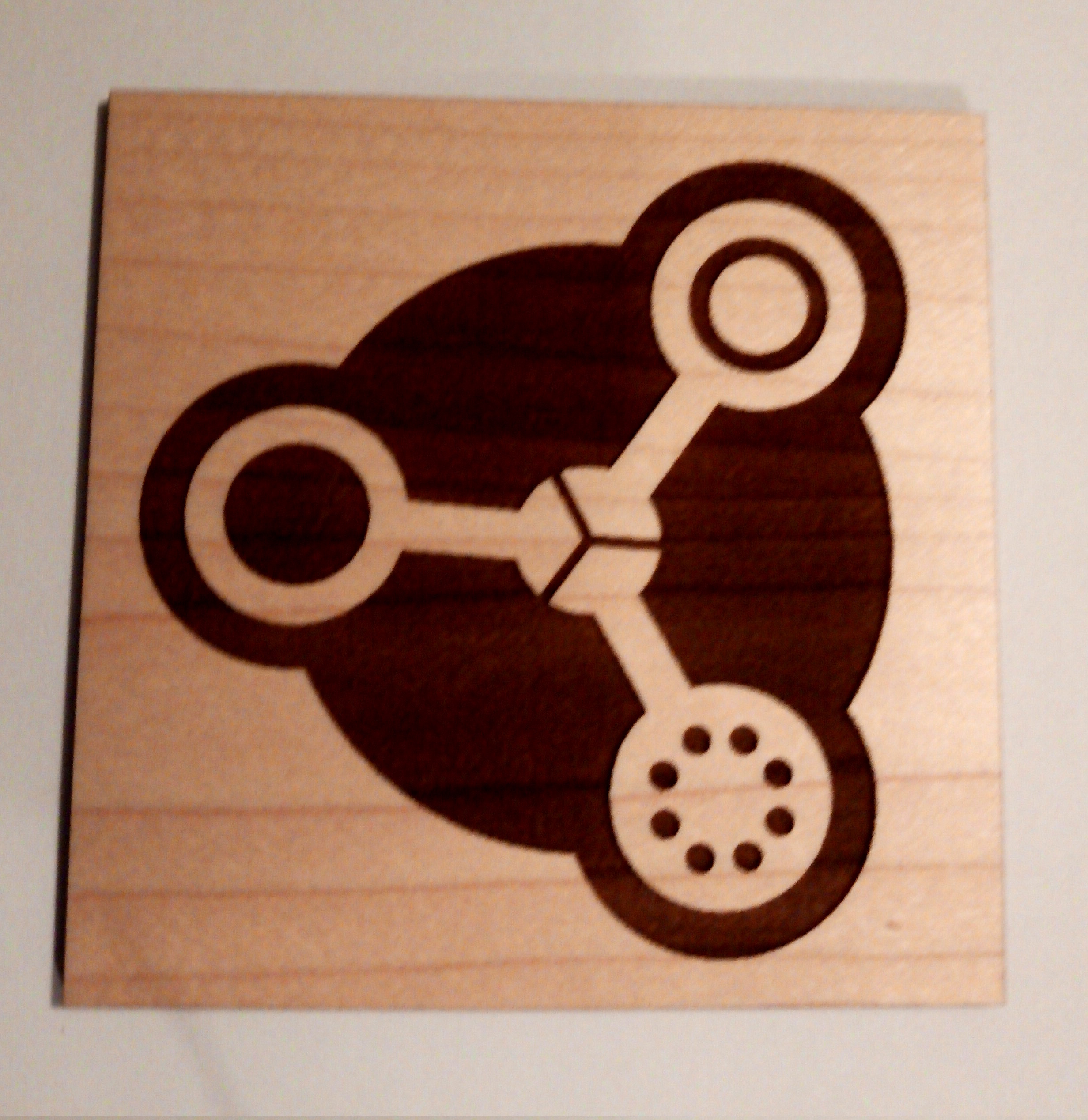
The poll to vote on a logo has run it’s course. I hope that that means that we have a new fancy logo!
Part of the reason I pushed for a logo was so we could have something that worked well in black and white. So to celebrate @gpereyrairujo’s wonderful design, I have laser laser cut it into a lovely piece of maple!
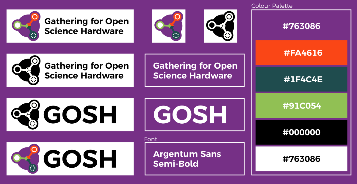
Assuming everyone is happy with the new design. I will go about cropping the white-space from the SVGs and make a little visual identity pack for GOSH.
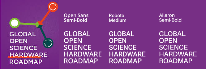
On the topic of visual identity, does anyone have a font preference? I tend to pick Open Sans for everything as it is Open and generally simple and inoffensive.
Don’t know. Of the 3 fonts that are mentioned so far none of them have any Os that are quite as circular. I actually really like the circular Os.
I suppose the other question that this begs is does GOSH stand for
“Gathering for Open Science Hardware”
or
“Global Open Science Hardware”
I always thought it was the first, but some some things seem to imply the second?
I spent a while looking at open fonts and Argentum Sans Semi-Bold is really close to the original font for the roadmap. It may even be the same font. I have made this little visual identity pack. Happy to change things if people don’t like it:
I like this and have merged. I did play with purple text and trying to make a version of the logo+words on a purple background, but I never got it to look nice. I am not really very good at design so I am happy to take suggestions for improvements.
Oh I prefer that! Maybe we do that for all the ones that say GOSH? Using my “walk to the other side of the room test” if the bottom text gets too small it just looks like GOSH is underlined.